Case Study: My OTA app pt. 1
May 5, 2020OTA created a mobile app in the past, but it was more of a website wrapper than a dedicated experience. It was time to redesign an experience that allows our students to consume education on-the-go.
Goals
- Allow students to check their calendar of classes and receive push notification alerts
- Allow students to watch videos directly from the app
- Allow students to access their tools and resources
- Export app to both Google and iOS store
- Works on both mobile and tablet devices of all resolutions
Design Process
As the UI/UX lead, it was my role to create a concept of the app, sell it to the stakeholders, and work together with the main developer to ensure its successful launch.
Research
The first step was discussing with the project stakeholders what were most important features to include in the first iteration. Since we already had an existing student portal online, it was easy to whittle it down to the essential pages. I also talked to the Customer Care team to understand pain points students often come to them for. If I can reduce the number of cases they need to deal with, it will be a successful redesign.
For the look & feel, it was important to maintain a cohesive brand, so I followed the design language I developed previously for consistency and a smaller cognitive load for our students when switching over to the app. Not all of the UI elements are transferrable between platforms, as apps have their own ubiquitous design patterns, but using similar colors, modules, and iconography is helpful.
I analyzed competitor apps for their strengths and weaknesses and ease-of-use. Our target demographic is higher than most other educational providers, so it was important that as always, design elements aid function and not hinder.
Known limitations: The app was going to be developed in the cross-platform program Xamarin instead of their respective native languages. This meant that certain features (e.g. drag, native overlays) would be unavailable, and I needed to design with the technology available.
Wireframes
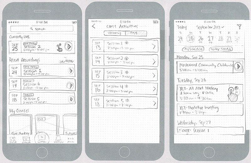
I like to start off with freeform low-fidelity wireframes to quickly jot down as many ideas and variations as possible. By drawing small thumbnails, I can get a clear overview picture of the project without getting bogged down by the details.
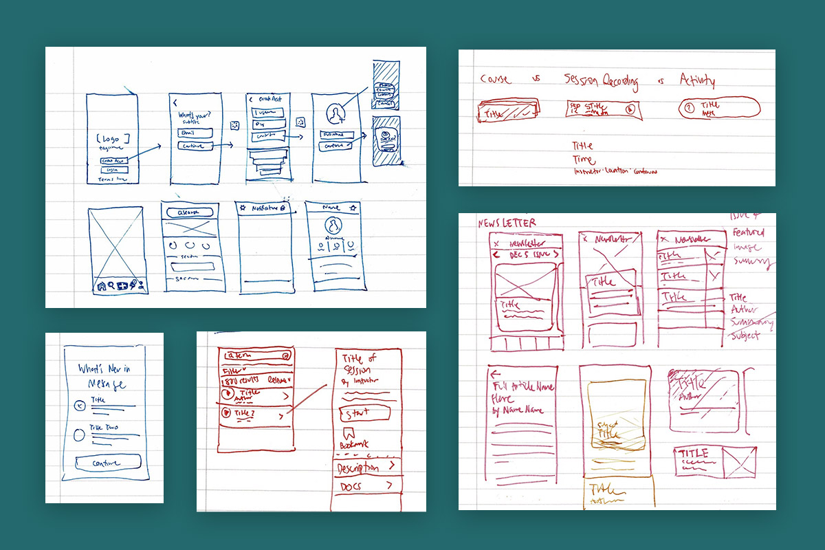
After getting a firmer hold on the direction I want to take, I clean them up into higher fidelity wireframes. I usually do this step digitally through Adobe XD, but this time I wanted to experiment with paper prototypes as a viable way to share and collaborate ideas in the design phase. I enjoyed being able to sit in a room and demonstrate the different gestures by “tapping” and “sliding” on the paper screens, but for larger groups and remote members, a digital file is still easier to share.
Mock-Up/Prototype
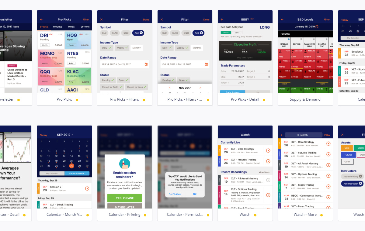
After the wireframes were approved, I worked on creating a pixel perfect mock in Invision for the developer. This was approved easily as well.
When I work on websites where I am also the main developer, I may sometimes skip this phase in lieu of creating a “coded mock” as I find it more efficient to inspect the different responsive breakpoints and animations/transitions without the need for recording software.
Launch
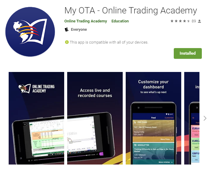
After a year, the final app was launched during OTA’s annual International Conference with a session walkthrough on all the features. It is also live and available to download on the iOS Store and Google Store with a 4.5 star rating.